
Recru
Speed up recruitment by 3X
A hassle-free way to get access to a pool of talent and make your workflow faster.
01 — Overview
The Challenge
In May 2020, I was approached by WorkDay on a tight deadline to design a mobile recruitment application end-to-end. The project demanded a full design lifecycle — from initial discovery and analysis through to a polished, interactive visual design.
Recru is the answer: a web app that transforms an otherwise fragmented, high-volume recruitment process into a single, intuitive workspace.
"How might we simplify the daily tasks of hiring managers while making it as straightforward as possible to surface and secure the right candidate?"
— Design brief, WorkDay × Recru appSystem Needs
Workflow Management
The interface should enable users to manage entire workflows — sourcing, reviewing CVs, moving candidates through stages — rather than only individual actions.
Task Management
Users need to create, post, and track job requisitions without leaving the app.
Communication
Purpose-built messaging tools for internal team communication and candidate outreach.
02 — Research
Research & Analysis
Recruitment at scale is genuinely complex. A typical recruiter manages dozens of open job requisitions simultaneously, each with a pipeline ranging from a handful of candidates to several hundred. Every candidate must travel through a defined journey — application review, screening calls, interviews, offer stage — and this journey must be carefully coordinated with the relevant hiring manager.
The root tension is one of attention management. Every day, a recruiter faces the same question:
Core Tension
"Which of my open roles needs my focus right now, and why?"
Different recruiters answer this differently. Some prioritise roles with the most new applicants; others focus on how long a role has been open, how close a candidate is to offer stage, or how dangerously thin the applicant pool has become. Without a unified system, this prioritisation is inconsistent, reactive, and error-prone.
03 — Design Process
The Design Process
Given the 2 week constraint, a lean but rigorous approach was essential. The process followed five clear phases:
1. Discovery
Competitive Analysis and User Interviews
2. Design
Mind Mapping and User Journey Mapping
3. Prototyping
Wireframes+Figma Prototype
4. Iterating
Usability Testing + KPI Development
5. Usability Testing
Zoom Sessions + Card Sorting
With research insights consolidated, I developed two representative personas drawn from WorkDay’s data. These personas served as a constant reference point throughout ideation and design, preventing scope creep and keeping decision-making grounded in real user behaviour.

I need a better way to track, screen and communicate more effectively.
Marcus
- Age:
- 34
- Location:
- Leeds
- Occupation:
- Senior Hiring Manager
Challenges
- Busy schedule with a booked calendar
- Not being able to keep track of job applications
- Managing time for interviews
Goals/ Needs
- Wants to be able to post job requirements
- Wants to be able to schedule interviews
- Wants to be able to review candidates
- Wants to be able to get frequent status updates
04 — Storyboarding
Storyboarding & Wireframing
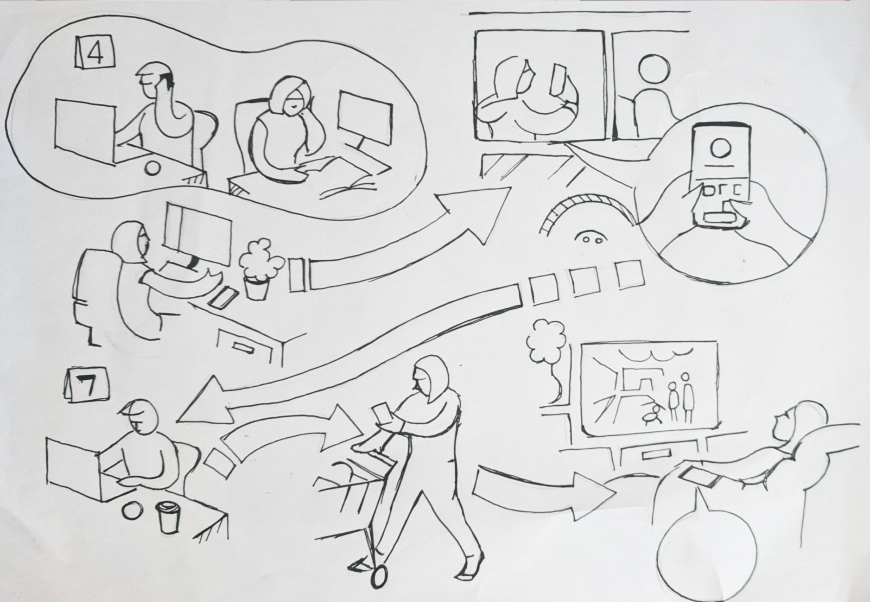
To get a better understanding of the tasks at hand I had created some simple storyboards to show the chain of events I had in mind. These reference drawings later helped develop assets for the onboarding screens for the app.
With proper planning, we were able to confidently move into creating wireframes for the app. We took the decision to focus more on the functionality and structure of the app, opting for low-fidelity wireframes with very little detail. Ultimately, we could add design elements in later, what was important for our users, was that the product (above all) was clear and simple.
Click any image to view full size — use arrows or keyboard to navigate.
04 — Decisions & Flows
Key Design Decisions
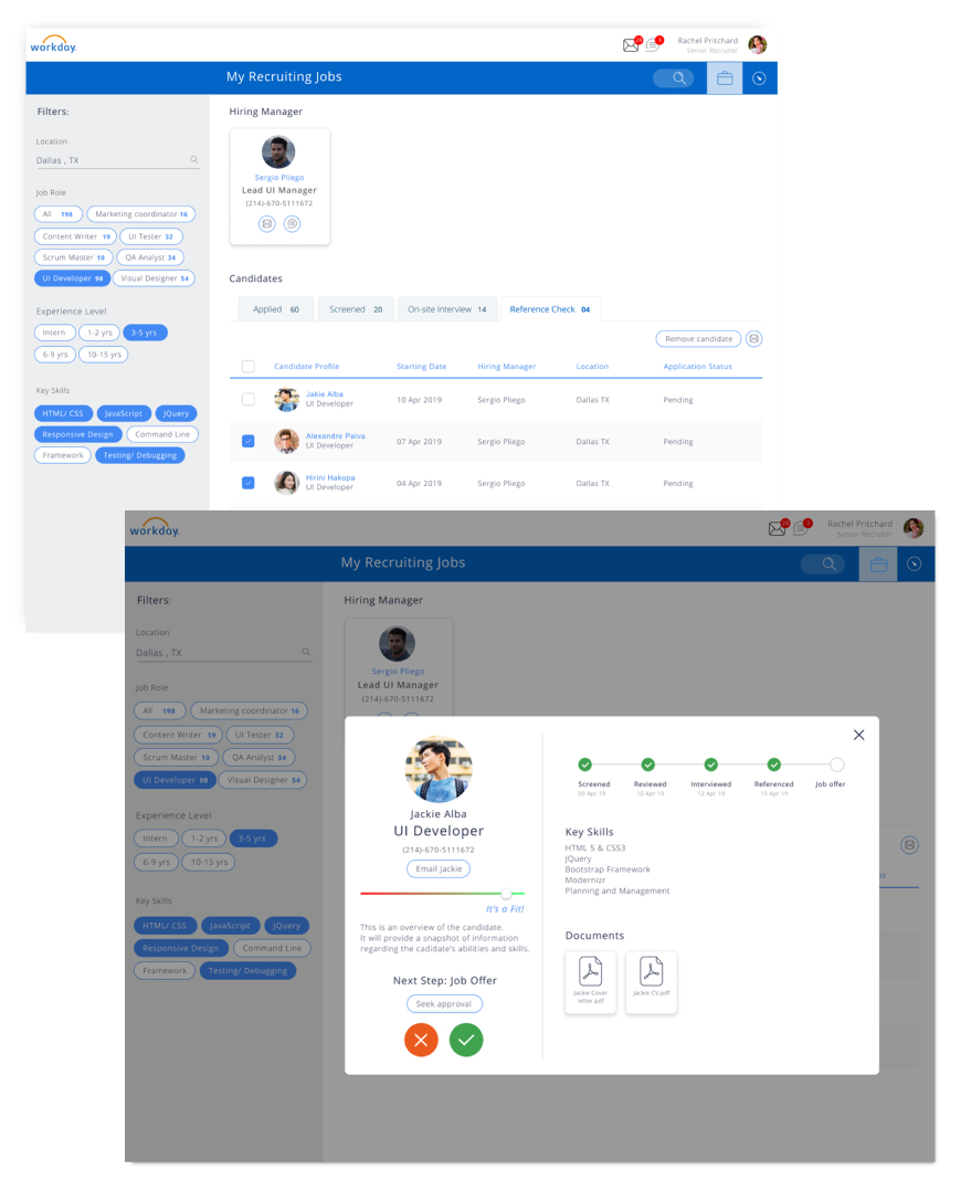
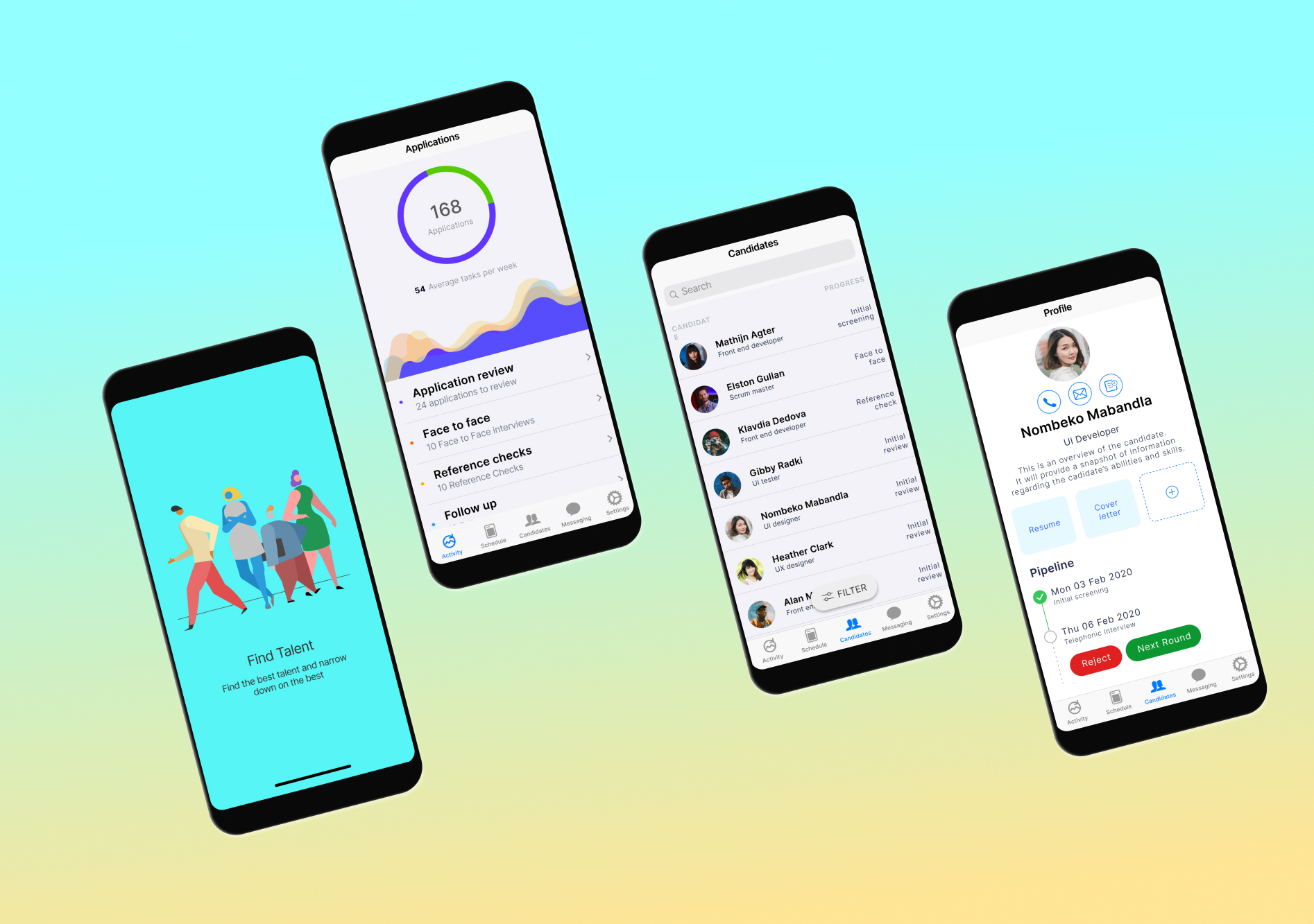
Priority Dashboard
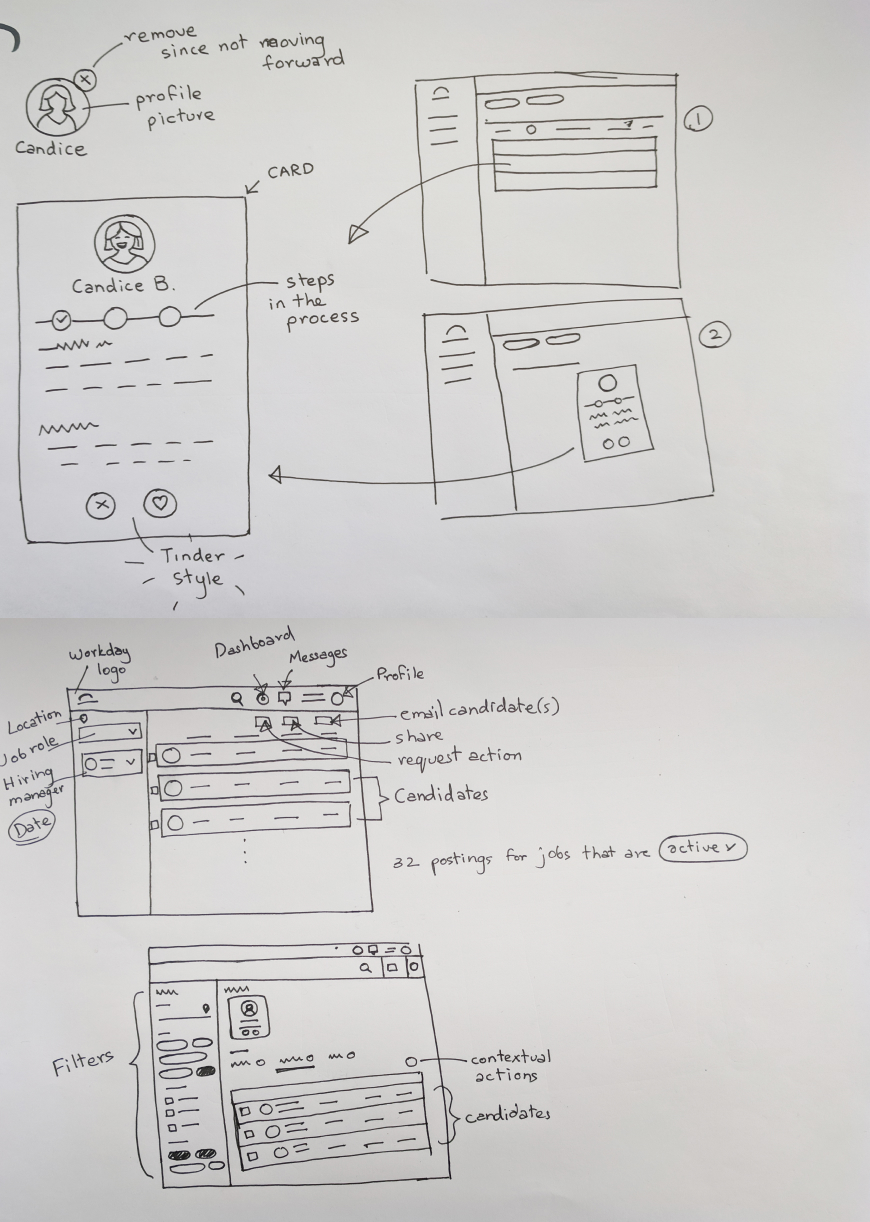
The core screen of Recru is not a list of jobs — it is a priority dashboard. Each job requisition is displayed as a card carrying its most critical signals: days open, candidate stage distribution, and a calculated urgency score. Recruiters can sort, filter, and pin cards according to their own working style, ensuring the system serves them — not the other way around.
Candidate Journey View
Rather than a flat applicant list, Recru presents each role as a visual pipeline. Candidates move through clearly labelled stages with a single swipe or tap, and the system surfaces blockers automatically — for example, flagging candidates who have been in a stage longer than the configured SLA.
Integrated Communication
To eliminate the context-switching that frustrated users most, Recru embeds a lightweight messaging layer directly into candidate and job records. Recruiters can message colleagues, schedule interviews, and send templated candidate updates without leaving the app.
Co-Sourcing & Collaboration
Recognising that recruitment is a team sport, Recru allows multiple recruiters to be assigned to a single requisition. Activity feeds surface what colleagues have done, preventing duplicated effort and keeping everyone aligned in real time.
Three concepts explored during ideation for Green Vibe.
Hiring Manager — User Flow
Defining the Role
The hiring manager identifies a staffing need, defines the responsibilities, required skills, and success criteria, then submits a job requisition to the recruiter to kick off the process.
Collaborating on Candidate Sourcing
The hiring manager stays aligned with the recruiter on what "good" looks like, reviews the shortlist, and gives early feedback to help refine the candidate pool before interviews begin.
Interviewing
The hiring manager conducts structured interviews, often alongside team members, assessing both technical fit and cultural alignment. They coordinate schedules and consolidate feedback from the panel.
Evaluating & Deciding
The hiring manager compares candidates, weighs feedback from all interviewers, and makes the final call — often in close consultation with HR or senior leadership for budget or headcount sign-off.
Task Flow
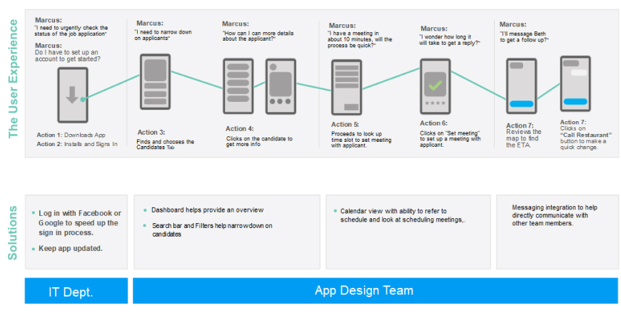
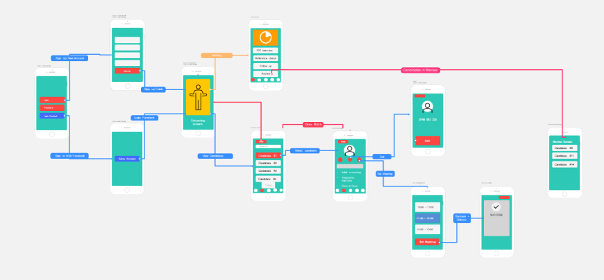
The task flow gives an idea of a single interaction of a user logging in and then exploring the app going about selecting a candidate and either calling him/her or setting up a meeting with the candidate.
05 —
Designing final screens
As decided on raw paper wireframes we wanted to have a filter to search through candidates quickly, and also reply back to them or send messages or emails to other team members in the process.
Click any image to view full size — use arrows or keyboard to navigate.
06 — Outcomes
Outcomes & Retrospective
Usability testing was conducted via Zoom sessions, complemented by card sorting exercises to validate information architecture decisions. The feedback from both expert reviewers and representative users was strongly positive across the board.
Comfort and usability scores improved significantly on the final design iteration. The visual cueing system — used to surface urgency and candidate status at a glance — was validated as effective across a variety of real-world recruitment scenarios.
— Key OutcomeExperts specifically highlighted the priority management system and the integrated communication layer as standout features, and encouraged continued exploration of richer interaction patterns and visual cues in future iterations.
07 — Reflections
What I Would Do Next
- Conduct additional rounds of usability testing with a larger, more diverse recruiter cohort.
- Investigate onboarding flows for first-time users unfamiliar with Kanban-style pipeline views.
- Develop a recruiter analytics dashboard to track KPIs such as time-to-hire and pipeline velocity.
- Expand accessibility coverage — colour contrast, dynamic type, and VoiceOver compatibility.
- Explore richer motion and micro-interaction design to reinforce system state changes.
Reflections
Designing Recru in 2 weeks was an exercise in disciplined prioritisation. The tight constraint forced me to focus relentlessly on the problems that mattered most to recruiters, and to resist the temptation of scope creep. It reinforced a conviction I hold about great UX: the best interfaces do not try to do everything — they do the most important things exceptionally well.
The project also demonstrated the value of structured research, even under time pressure. The competitive analysis and user interviews, though brief, surfaced insights that would have been impossible to guess — and they shaped every subsequent design decision in a meaningful, traceable way.